Summer 2026 Colors: How to Apply Trends in Beachwear and Casual Collections
19 de October de 2025 • Texneo • Tendências
See how to apply Summer 2026 colors to beachwear and casual fashion collections using prints, innovative fabrics, texture, and product strategy.
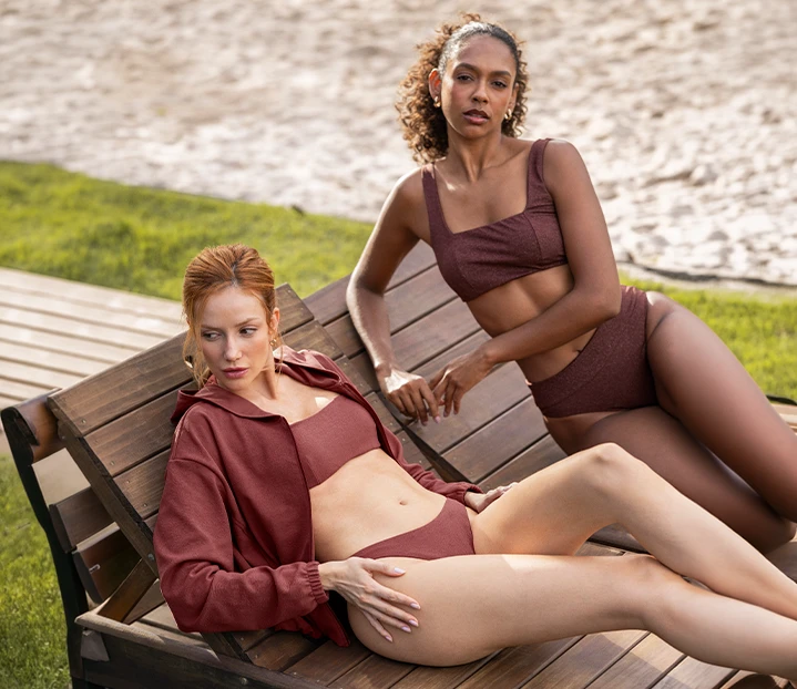
Summer collections require more than just a beautiful color palette. They need to translate behavior, comfort, visual identity, and consumer desire into garments that perform well in retail, digital channels, and everyday wear. That’s why understanding the Summer 2026 color trends is an important step.
Especially for brands seeking to create products that are more aligned with fashion trends, particularly in segments such as beachwear, resort wear, and casualwear.
The goal here is to present references, combinations, and creative approaches that help transform trends into cohesive, commercially appealing, and visually impactful collections.
By observing the Summer 2026 color trends, fashion brands can anticipate consumer desires, create more consistent visual narratives, and strengthen product planning for the upcoming season.
Color is one of the first elements consumers notice. Even before texture, fit, or fabric composition, the color palette communicates style, intended use, and brand positioning.
For 2026, trend forecasts point toward a balance between softness, freshness, and energy. Light tones, natural bases, aquatic nuances, and sun-inspired shades can coexist in collections that seek visual impact without sacrificing sophistication.
In this context, the seasonal palette helps guide decisions regarding solid colors, prints, textures, and combinations. Brands do not need to follow a rigid color chart, but they can use these signals to create a visual identity that is more aligned with consumer behavior.
It is also worth considering how the color of the year and other color forecasts influence the season’s visual imagination. Even when brands do not adopt these shades literally, they help map desires connected to calmness, lightness, nature, technology, and renewal.
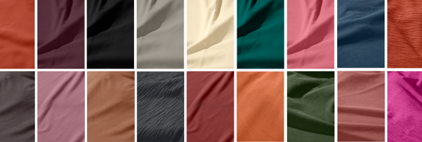
Working with trends does not mean reproducing exactly what appears in reports, runways, or international showcases. A brand’s role is to translate references according to its audience, positioning, and product proposal.
A beachwear collection, for example, may adopt a more vibrant and tropical palette. A casual line may prefer natural tones, illuminated neutrals, and colors that transition easily between leisure, travel, and urban everyday life.
The most important factor is turning research into practical decisions. This involves evaluating how each color behaves on a fabric, how it interacts with prints, and how it can be combined within product families.
Some possible approaches include:
This approach helps create collections with variety while maintaining visual consistency.
In beachwear, color plays an even more strategic role. Bikinis, one-piece swimsuits, cover-ups, tops, shorts, and coordinated pieces often have strong visual appeal, especially in store displays, social media, and campaigns.
Beachwear trends for 2026 point toward palettes inspired by the sea, sand, sunsets, tropical vegetation, and resort lifestyle. This creates opportunities for aquatic greens, deep blues, off-whites, coral shades, terracotta, soft yellows, and light pinks.
For beachwear brands, Summer 2026 colors can appear in both solid pieces and exclusive prints. A well-planned palette makes it possible to create standout products, commercial coordinates, and continuity items within the same visual narrative.
The secret lies in balancing desire with sales potential. Some products can embrace bolder colors for campaigns, while others support the collection with easy-to-match shades and stronger sell-through potential.
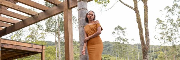
Casual summer collections also benefit from carefully planned palettes. Dresses, T-shirts, tops, skirts, shorts, lightweight pants, and coordinated sets need to work across different moments throughout the day.
When applying the seasonal palette to casual collections, it is worth considering the transition between leisure, travel, urban routines, and outdoor experiences. The same color can appear sophisticated or relaxed depending on the fabric, silhouette, and print.
An off-white in a textured fabric, for example, can communicate natural elegance. A vibrant blue in a lightweight fabric may convey freshness. A soft pink can create a delicate look, while oranges and yellows add energy.
The Summer 2026 colors can also be organized according to usage occasions. Neutral shades work well for versatile pieces, while vibrant colors help highlight launches, window displays, and campaign editorials.
Prints remain essential for differentiating products and creating desirability. During summer, they help reinforce stories related to travel, nature, movement, and personality.
To apply the palette more effectively, brands can view prints as an extension of the color composition. In this way, each design becomes part of a visual story rather than an isolated element.
Some of the most relevant directions include:
When the Summer 2026 colors guide print development, the result tends to be more cohesive. Brands can better connect backgrounds, motifs, scale, and contrast across products that work together.
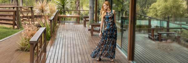
Mixing prints can be a powerful tool, but it requires careful execution. To work effectively, the designs must share common elements such as color, scale, theme, or graphic style.
A useful strategy is defining a leading color and repeating it across different designs. Aquatic green foliage, for example, can coordinate seamlessly with stripes containing the same tone.
Another possibility is using controlled contrasts. A neutral-based animal print can be combined with botanical prints in earthy tones, creating a striking yet sophisticated aesthetic.
Within this type of design strategy, the Summer 2026 colors function as a unifying element, allowing different patterns to coexist harmoniously.
That is why choosing the right fabric is just as important as defining the color palette. A light shade on a woven fabric may communicate lightness, while the same color on a structured knit fabric may appear more urban and sophisticated.
Textured fabrics tend to enhance neutral and natural tones because they add visual depth even to solid-color garments. Meanwhile, elastic fabrics with excellent recovery support beachwear and casual styles focused on comfort.
Summer discussions also involve functionality. Consumers are increasingly attentive to comfort, drying performance, hand feel, protection, breathability, and perceived quality.
When developing products inspired by these visual trends, brands should evaluate how textile technology can support collection goals. Fabrics with excellent drape, elasticity, durability, and finishing help garments deliver more than just appearance.
It is also important to consider more responsible choices. Nature-inspired palettes become even stronger when combined with materials, processes, and narratives aligned with environmental responsibility.
In commercial planning, Summer 2026 colors can be divided into foundation shades, statement colors, and supporting variations. This approach helps balance easy-to-sell products with pieces that create strong visual impact.
A practical structure may include:
With this organization, the palette moves beyond inspiration and becomes a guide for product decisions, raw material purchasing, communication strategies, and visual merchandising.
A strong collection should offer variety without appearing disconnected. For this reason, color combinations must be considered from the beginning.
Some effective combinations include:
The Summer 2026 colors help create products with different levels of impact. Some pieces can be highly commercial and easy to wear, while others become campaign highlights.
Choosing colors, prints, and fabrics involves numerous decisions. For beachwear and casual fashion brands, working with a specialized textile partner can accelerate development and increase product confidence.
Texneo operates in the textile solutions market with a focus on innovation, technology, quality, and application possibilities for different sectors. This allows the company to support brands seeking to transform inspiration into viable, competitive collections aligned with consumer behavior.
If your brand is planning a new collection, now is the time to connect trends, raw materials, and strategy.
Talk to Texneo specialists to develop products that are better aligned with summer trends, your target audience, and your brand’s goals.
The upcoming season can unite calmness, freshness, nature, energy, and visual expression. For beachwear and casual fashion brands, this combination creates opportunities for versatile, sensory collections with strong commercial appeal.
More than following a trend, the challenge is translating behavioral signals into successful products. This requires selecting the right palette, coordinating prints, exploring textures, choosing appropriate fabrics, and maintaining consistency with brand identity.
When color, material, and concept work together, collections become more coherent and relevant to consumers.
In this sense, the Summer 2026 colors serve as a strategic guide for brands seeking to combine aesthetics, textile technology, and market differentiation.
Take summer trends to the next level with Texneo and transform inspiration into fabrics, products, and experiences that connect your brand to the season.
Especially for brands seeking to create products that are more aligned with fashion trends, particularly in segments such as beachwear, resort wear, and casualwear.
The goal here is to present references, combinations, and creative approaches that help transform trends into cohesive, commercially appealing, and visually impactful collections.
By observing the Summer 2026 color trends, fashion brands can anticipate consumer desires, create more consistent visual narratives, and strengthen product planning for the upcoming season.
Why Do Summer 2026 Colors Matter for Collection Development?
Color is one of the first elements consumers notice. Even before texture, fit, or fabric composition, the color palette communicates style, intended use, and brand positioning.
For 2026, trend forecasts point toward a balance between softness, freshness, and energy. Light tones, natural bases, aquatic nuances, and sun-inspired shades can coexist in collections that seek visual impact without sacrificing sophistication.
In this context, the seasonal palette helps guide decisions regarding solid colors, prints, textures, and combinations. Brands do not need to follow a rigid color chart, but they can use these signals to create a visual identity that is more aligned with consumer behavior.
It is also worth considering how the color of the year and other color forecasts influence the season’s visual imagination. Even when brands do not adopt these shades literally, they help map desires connected to calmness, lightness, nature, technology, and renewal.
How to Interpret Summer 2026 Colors Without Copying Trends
Working with trends does not mean reproducing exactly what appears in reports, runways, or international showcases. A brand’s role is to translate references according to its audience, positioning, and product proposal.
A beachwear collection, for example, may adopt a more vibrant and tropical palette. A casual line may prefer natural tones, illuminated neutrals, and colors that transition easily between leisure, travel, and urban everyday life.
The most important factor is turning research into practical decisions. This involves evaluating how each color behaves on a fabric, how it interacts with prints, and how it can be combined within product families.
Some possible approaches include:
- Using light tones as the foundation for timeless pieces.
- Applying blues and greens in concepts related to freshness.
- Exploring pinks, yellows, and oranges in sun-inspired lines.
- Combining warm neutrals with botanical prints.
- Creating contrast between vibrant shades and soft backgrounds.
This approach helps create collections with variety while maintaining visual consistency.
How to Apply Summer 2026 Colors in Beachwear
In beachwear, color plays an even more strategic role. Bikinis, one-piece swimsuits, cover-ups, tops, shorts, and coordinated pieces often have strong visual appeal, especially in store displays, social media, and campaigns.
Beachwear trends for 2026 point toward palettes inspired by the sea, sand, sunsets, tropical vegetation, and resort lifestyle. This creates opportunities for aquatic greens, deep blues, off-whites, coral shades, terracotta, soft yellows, and light pinks.
For beachwear brands, Summer 2026 colors can appear in both solid pieces and exclusive prints. A well-planned palette makes it possible to create standout products, commercial coordinates, and continuity items within the same visual narrative.
The secret lies in balancing desire with sales potential. Some products can embrace bolder colors for campaigns, while others support the collection with easy-to-match shades and stronger sell-through potential.
Applications in Casual and Resort Collections
Casual summer collections also benefit from carefully planned palettes. Dresses, T-shirts, tops, skirts, shorts, lightweight pants, and coordinated sets need to work across different moments throughout the day.
When applying the seasonal palette to casual collections, it is worth considering the transition between leisure, travel, urban routines, and outdoor experiences. The same color can appear sophisticated or relaxed depending on the fabric, silhouette, and print.
An off-white in a textured fabric, for example, can communicate natural elegance. A vibrant blue in a lightweight fabric may convey freshness. A soft pink can create a delicate look, while oranges and yellows add energy.
The Summer 2026 colors can also be organized according to usage occasions. Neutral shades work well for versatile pieces, while vibrant colors help highlight launches, window displays, and campaign editorials.
Prints That Strengthen the Collection Narrative
Prints remain essential for differentiating products and creating desirability. During summer, they help reinforce stories related to travel, nature, movement, and personality.
To apply the palette more effectively, brands can view prints as an extension of the color composition. In this way, each design becomes part of a visual story rather than an isolated element.
Some of the most relevant directions include:
- Tropical or botanical leaf prints.
- Refined animal prints.
- Stripes and graphic patterns for nautical collections.
- Watercolor florals on soft backgrounds.
- Abstract designs inspired by landscapes.
- Coordinated print mixes.
When the Summer 2026 colors guide print development, the result tends to be more cohesive. Brands can better connect backgrounds, motifs, scale, and contrast across products that work together.
Print Mixing, Logomania, and Visual Identity
Mixing prints can be a powerful tool, but it requires careful execution. To work effectively, the designs must share common elements such as color, scale, theme, or graphic style.
A useful strategy is defining a leading color and repeating it across different designs. Aquatic green foliage, for example, can coordinate seamlessly with stripes containing the same tone.
Another possibility is using controlled contrasts. A neutral-based animal print can be combined with botanical prints in earthy tones, creating a striking yet sophisticated aesthetic.
Within this type of design strategy, the Summer 2026 colors function as a unifying element, allowing different patterns to coexist harmoniously.
The Role of Fabric in Color Perception
The same color can look completely different depending on the fabric base. Shine, opacity, elasticity, texture, hand feel, and weight all influence how consumers perceive a garment.That is why choosing the right fabric is just as important as defining the color palette. A light shade on a woven fabric may communicate lightness, while the same color on a structured knit fabric may appear more urban and sophisticated.
Textured fabrics tend to enhance neutral and natural tones because they add visual depth even to solid-color garments. Meanwhile, elastic fabrics with excellent recovery support beachwear and casual styles focused on comfort.
Technological Materials and More Conscious Choices
Summer discussions also involve functionality. Consumers are increasingly attentive to comfort, drying performance, hand feel, protection, breathability, and perceived quality.
When developing products inspired by these visual trends, brands should evaluate how textile technology can support collection goals. Fabrics with excellent drape, elasticity, durability, and finishing help garments deliver more than just appearance.
It is also important to consider more responsible choices. Nature-inspired palettes become even stronger when combined with materials, processes, and narratives aligned with environmental responsibility.
How to Apply the Palette in Collection Planning
To turn trends into products, design teams can organize collections into color families. This simplifies the development of prints, solids, coordinated pieces, and key products.In commercial planning, Summer 2026 colors can be divided into foundation shades, statement colors, and supporting variations. This approach helps balance easy-to-sell products with pieces that create strong visual impact.
A practical structure may include:
- Core colors for permanent products.
- Accent colors for displays and campaigns.
- Natural tones for sophisticated pieces.
- Vibrant shades for high-impact products.
- Coordinated prints to increase outfit possibilities.
- Textures that elevate solid garments.
With this organization, the palette moves beyond inspiration and becomes a guide for product decisions, raw material purchasing, communication strategies, and visual merchandising.
Combination Ideas for Beachwear and Casual Collections
A strong collection should offer variety without appearing disconnected. For this reason, color combinations must be considered from the beginning.
Some effective combinations include:
- Off-white with aquatic green for a natural aesthetic.
- Deep blue with coral for a tropical contrast.
- Soft pink with sand tones for subtle elegance.
- Terracotta with green foliage for an organic look.
- Soft yellow with white for sun-inspired freshness.
- Animal print with warm neutrals for sophistication.
- Tonal logos applied to textured bases.
The Summer 2026 colors help create products with different levels of impact. Some pieces can be highly commercial and easy to wear, while others become campaign highlights.
Why Partner with Texneo for Your Collection Development?
Choosing colors, prints, and fabrics involves numerous decisions. For beachwear and casual fashion brands, working with a specialized textile partner can accelerate development and increase product confidence.
Texneo operates in the textile solutions market with a focus on innovation, technology, quality, and application possibilities for different sectors. This allows the company to support brands seeking to transform inspiration into viable, competitive collections aligned with consumer behavior.
If your brand is planning a new collection, now is the time to connect trends, raw materials, and strategy.
Talk to Texneo specialists to develop products that are better aligned with summer trends, your target audience, and your brand’s goals.
Trends, Products, and Strategy Must Work Together
The upcoming season can unite calmness, freshness, nature, energy, and visual expression. For beachwear and casual fashion brands, this combination creates opportunities for versatile, sensory collections with strong commercial appeal.
More than following a trend, the challenge is translating behavioral signals into successful products. This requires selecting the right palette, coordinating prints, exploring textures, choosing appropriate fabrics, and maintaining consistency with brand identity.
When color, material, and concept work together, collections become more coherent and relevant to consumers.
In this sense, the Summer 2026 colors serve as a strategic guide for brands seeking to combine aesthetics, textile technology, and market differentiation.
Take summer trends to the next level with Texneo and transform inspiration into fabrics, products, and experiences that connect your brand to the season.
 Go back